-->

Tuesday, 23 October 2018

BitCoin ticker with Python, Kafka and Bokeh

Hi all,

Today, just a variation of the previous bitcoin ticker.

The concept is still simple but involves differents tools :

  • using Python
  • calling public rest service for Bitcoin rates
  • sending data into kafka topic
  • polling the topic to retrieve bitcoin rates
  • updating in real time, n second interval, a bokeh page with a nice graph

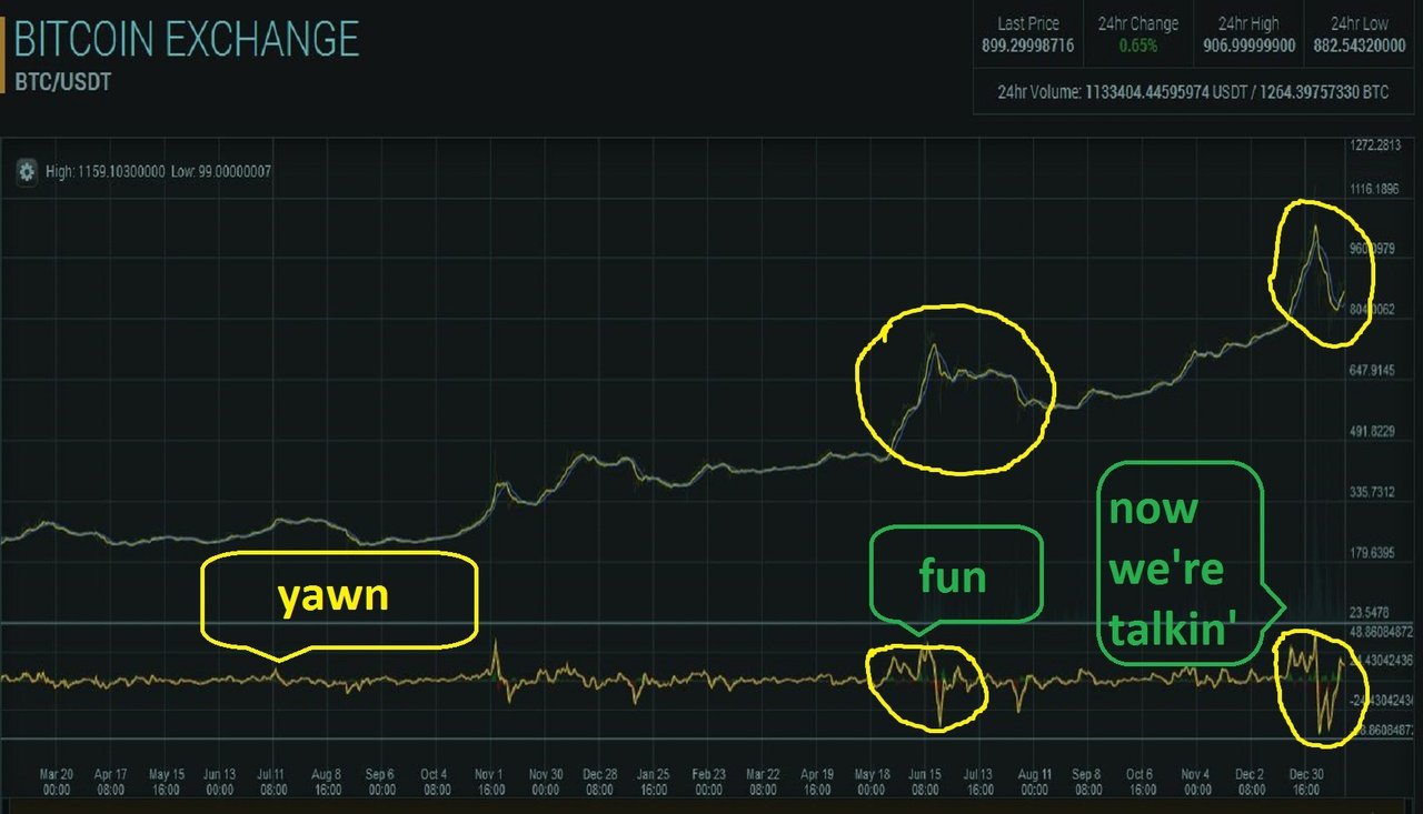
Résultat de recherche d'images pour "bitcoin trader fun"

Architecture

The “architecture” for this projet is fairly simple :

  • a server in the cloud running python and kafka
  • a workstation running python an bokeh
  • public REST service delivering bitcoin rates

image

Process

You can easily find rest services providing data about Bitcoin. I chose to use this rest call : https://min-api.cryptocompare.com/data/price?fsym=BTC&tsyms=USD,EUR&e=Coinbase&extraParams=your_app_name

Pretty simple, this service returns some compact json data. In this use case, I will parse the json object and retrieve the USD rate only.

{"USD":8089.97,"EUR":6556.01}

The overall process is :

  • the cloud server is running a python script polling REST service to grab bitcoin rates and stores the data in kafka topic called “btc_ticker”
  • the workstation is running a second python script polling the Kafka server and updates the data in a bokeh powered graph
  • you can choose the polling rates as well as the graph update rates

All the pieces in action

Server side

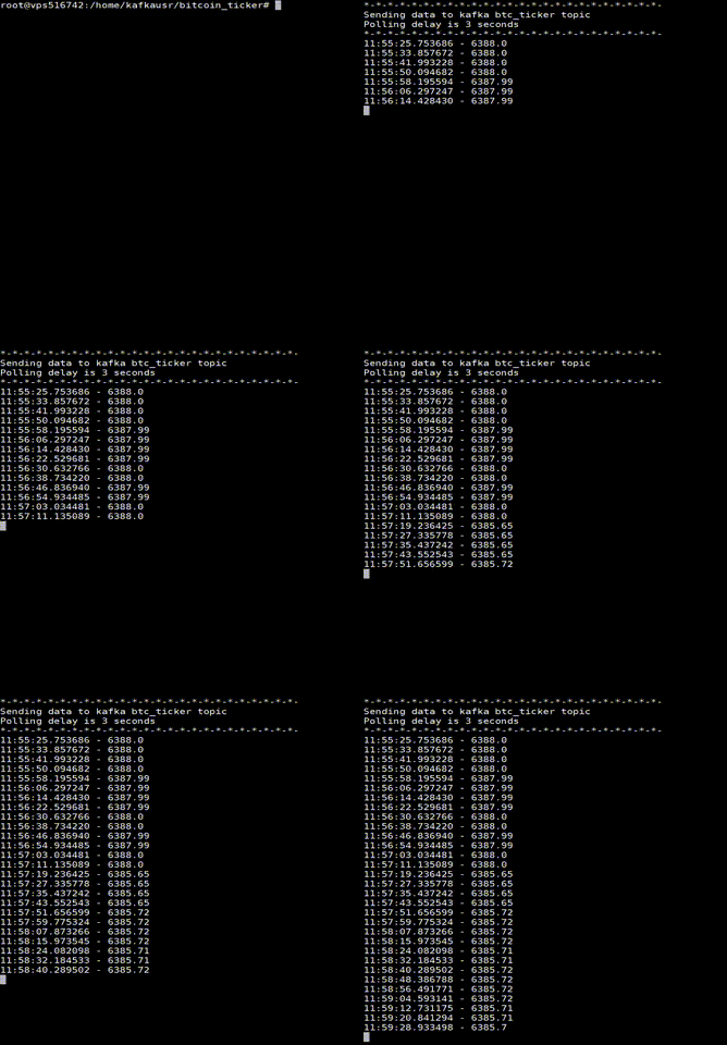
Start the python script doint the REST poller Kafka producer. Here is an accelerated gif showing the polling in action. I managed to capture a some variation on the BTC rate here.

ezgif.com-optimize

The BTC rates are now flowing into a Kafka topic called btc_ticker. We can verify with Kafka Tool :

image

Workstation side

On the workstation side, things are just a bit more complex. Just a bit.

First start the bokeh server. Careful here, very complex operation as you can see below.

ezgif.com-crop

The we can start our second python script, the client side one. This script will connect to kafka server, instanciate a consumer, then within an infinite loop, will retrieve data and update a real time graph in Bokeh.

I’m using Visual Studio Code for Python coding along with Jupyter. Once the script is started, a web page is automatically opened and we can discover our Bokeh graph in real time.

The output, with bokeh, is a simple html page displaying the graph and updating in real time. For this example, I chose a 3 seconds refresh rate (pretty useless but this was fun to see the high Bitcoin volatility).

Look at this accelerated gif, created from a record on October 23 2108, displaying the rates for approx 40 minutes. I tried to capture data having obvious variations.

ezgif.com-gif-maker (1)

The scripts

This is the server side script. Please contact me for the bokeh client side script.

image

More to come

This is a quite simple example. Next, I will add some “intelligence” and data processing in Kafka, for instance adding a moving average accross different Bitcoin rates suppliers.

Wednesday, 2 May 2018

Python, REST, Json and gmaps : plotting data

Hi all,

Let’s continue with another small and quick Python use case on data.

Here is a use case to plot gmaps heatmap with Python. The data is coming from a live REST service (New York city bike, because it is live, free and easy) and a simple JSON parsing is done to catch the location data.

I’m using Jupyter Notebook, which is THE Python platform for data manipulation, exploration, testing, science etc …

Here is the code, fairly simple. Of course you need a gmaps api key.

I decided to render a heatmap because it is eye candy but you can render anything you want (marks…). Next time, I will show you how to embed data into the map and add some real time features (read the previous article about real time plotting : http://open-bi.blogspot.ch/2018/04/simple-and-compact-python-bitcoin-ticker.html).


import gmaps
import requests
import gmaps.datasets
import numpy as np

gmaps.configure(api_key="xxxxxxxxxxxxxxxxxxxxxxxxxxxxxxxxx") # Your Google API key

url = 'https://gbfs.citibikenyc.com/gbfs/en/station_information.json'
print('Processing url request ....')
r = requests.get(url)
r.json()
data = r.json()

coords = []
locations = []

for i in data['data']['stations']:
    lat = float(i['lat'])
    lon = float(i['lon'])
    coords = [lat, lon]
    locations.append(coords)      
#hard coded coordinates for New York below, but you can do something better …
fig = gmaps.figure(center=(40.71448, -74.00598), zoom_level=12, layout={
        'width': '700px',
        'height': '800px',
        'padding': '3px',
        'border': '1px solid black'
})
fig.add_layer(gmaps.heatmap_layer(locations))
fig
Processing url request ....
image
          

Wednesday, 18 April 2018

Simple & compact Python Bitcoin ticker

Hi all,

Today, just fun.

I wrote a simple Bitcoin ticker. The concept is simple :

  • using Python
  • calling public rest service for Bitcoin rates
  • using matplotlib
  • updating in real time, 1 second interval just for fun

    Using Python

    It’s not breaking news, Python has a great success in data manipulation, exploration, visualization and science. Next time, I’ll show you some nice map rendering with Jupyter Notebooks, which I recommend for any data science project.

    Here are the imports I used for this demonstration :

    Public Rest services for Bitcoin rates

    You can easily find rest services providing data about Bitcoin. I chose to use this rest call : https://min-api.cryptocompare.com/data/price?fsym=BTC&tsyms=USD,EUR&e=Coinbase&extraParams=your_app_name

    Pretty simple, this service returns some compact json data. In this use case, I will parse the json object and retrieve the USD rate only.

    {"USD":8089.97,"EUR":6556.01}

    Of course it is recommended to use data from different services, coming from different providers in order to have multiple Bitcoin rates and build something like an average.

    The output

    The output, with matplotlib, is a simple window displaying the graph and updating in real time. For this example, I chose a 1 second refresh rate (pretty useless but this was fun to see the high Bitcoin volatility).

    Look at this accelerated gif, created from a record on April 18 2108, displaying the rates for approx 20 minutes. Sorry for the bad recording quality, I’ll do better soon.

    8pris-bjbkl

    The script

    You can simply copy and paste this script, it will simply work. Just be sure to install the required packages. Just for information, I’m using Visual Studio Code for this use case.

    import numpy as np  
    import requests  
    import datetime  
    import time  
    import calendar  
    import matplotlib.pyplot as plt  
    from matplotlib import animation  
       
    x = np.arange(100000) # 100000 polling points  
    usd = []  
      
    fig, ax = plt.subplots()  
    line, = ax.plot([], [], 'k-')  
    ax.margins(0.05)  
       
    def init():  
      line.set_data(x[:2],usd[:2])  
      return line,  
       
    def animation(i):  
      time.sleep(1)  
      url = 'https://min-api.cryptocompare.com/data/price?fsym=BTC&tsyms=USD,EUR&e=Coinbase&extraParams=your_app_name'    
      r = requests.get(url)  
      r.json()  
      data = r.json()  
      usd.append(float(data['USD']))  
         
      win = 86400  
      imin = min(max(0, i - win), x.size - win)  
      xdata = x[imin:i]  
      ydata = usd[imin:i]  
      
      line.set_data(xdata, ydata)  
      ax.relim()  
      ax.autoscale()  
      return line,  
       
    anim = animation.FuncAnimation(fig, animation, init_func=init, interval=25)  
    plt.show()  
              

    Monday, 19 March 2018

    Quick and clever data sparsity / density tool

    Hi all,

    Just a quick post today to share a clever python tool I’m using for data sparsity / density analysis.

    • Data sparsity : number or percentage of cells that are empty.
    • Data density : number or percentage of cells that contain information.

    density

    It’s quite common to find tools or libraries that aim to analyse data and deliver indicators. What I wanted is to have a datavisualization tool in order to display a meaningful picture of data density / sparsity.

    Here comes “missingno”, developed by Aleksey Bilogur, a really talented data analyst from NYC, and available on github.

    No more bla-bla, here is what you can get with simple python code within your Jupyter editor.

    image

    You can clearly see the amout of data available for each column. Not the nice sparkline on the right, showing “missing data bursts”.

    Different plots are available, have a look on this “heatmap” showing nullity correlation : how the presence or absence of one variable has a correlation in the presence of another.

    image

    Bars, GeoPlot and Dendogram are also available.

    Definitely a must have tool for all python and data enthusiasts.

    Tuesday, 2 May 2017

    Reading online SDMX data from R

    Hi all,


    After writing http://open-bi.blogspot.ch/2014/12/easy-query-to-sdmx-data.html some time ago (long time ...), I recently had to query online SDMX data from R.

    Nothing more easier than playing with RSDMX package.

    Just install this package : install.packages("rsdmx")
    Then just play with it.

    Here is a short exemple with a query to one ECB SDMX datasource.
     # Install and load the package  
     install.packages("rsdmx")  
     library(rsdmx)
    
     # First, set a proxy if you are behind corporate walls  
     Sys.setenv(http_proxy="http://xxxx:xxxx@xxxxxxx:8080")  
    
     # Then store your custom url, the one having the dataset you need  
     myUrl <- "http://stats.oecd.org/restsdmx/sdmx.ashx/GetData/MIG/TOT../OECD?startTime=2000&endTime=2011"  
    
     # Read and parse the data  
     dataset <- readSDMX(myUrl)  
    
     #Print the data. Tadam, your dataset is in a dataframe !   
     stats <- as.data.frame(dataset)   
    
     # Now, do intelligent stuff ...  
    

    Now, the data.
    Really easy and time saving.


    Monday, 15 December 2014

    Easy query to SDMX data

    Hi all,

    As usual, too many things to share and too little time to write.
    Well, this time, I'm doing it.

    I'm currently working on a Data Federation / Data Virtualization project, aiming at virtualizing data coming from different horizons : public data from web services, commercial data coming from data feeds, internal and relational data etc ...

    One of my data sources is the Statistical DataWarehouse (SDW) from the European Central Bank (ECB). That's funny because 12 or 13 years ago, I was feeding that ECB Warehouse while working for the French National Bank (NCBs).
    This warehouse is open to every one and you will find data about employment, production ... well a lot of economic topics well organized into "Concepts" :
    • Monetay operations,
    • Exchange rates,
    • Payment and securities trading
    • Monetary statistics and lots of funny things like this ...
    This warehouse can be queried with the use of the ECB front end, located here.
    You can also query it by using the REST services. That's my preferred choice for data processing automation and this article will developp this point.

    Before querying the data, let's have a quick explanation about the SDMX format that is used by the ECB.

    SDMX, theory

    SDMX stands for Statistical Data and MetaData eXchange. This project started in 2002 and aims at giving a standard for statistical data and metadata exchange. Several famous institutions are at the origin of SDMX :
    SDMX is an implementation of ebXML.
    You will find a nice SDMX tutorial here, for the moment here is a quick model description :
    • Descriptor concepts : give sense to a statistical observation
    • Packaging structure : hierarchy for statistical data : observation level, group level, dataset level ...
    • Dimensions and attributes : dimensions for identification and description. Attributes for description only.
    • Keys : dimensions are grouped into key sequence and identify an item
    • Code lists : list of values
    • Data Structure Definition : description for structures

    SDMX, by example

    Here is an example of what SDMX data is. This is an excerpt of a much longer file.
    Click for a larger view.

    As you can see, we have :
    • Metadatas :
      • Serieskey : giving all the values for each dimensions.
      • Attributes : definition for this dataset
    • Data
      • Observation dimension : time, in this example.
      • Observation value : the value itself.

    How to build a query to ECB data

    There is nothing easier for that : use the REST web services provided by the ECB.
    These web services will allow you to :
    • Query metadata, in order 
    • Query structure definitions
    • Query data : this is the interesting part for this article !
    The REST endpoint is here : https://sdw-wsrest.ecb.europa.eu/service/
    And you can learn more about these services here

    But let me write a quick overview now. It is very simple as sooon as you understood it.
    Let's write a REST query for some ECB data.

    First you need the base service url.
    • Easy, it is : https://sdw-wsrest.ecb.europa.eu/service/
    Then, you need to target a resource. Easy, it is "data".
    • Now you have the url : https://sdw-wsrest.ecb.europa.eu/service/data
    Ok, let's go further, now we need to specify an "Agency". By default it is ECB, but in our example let's go for EUROSTAT.
    • We have the url : https://sdw-wsrest.ecb.europa.eu/service/data/eurostat
    And we continue, now we need a serie name. For this example, let's go with IEAQ.
    • The url is : https://sdw-wsrest.ecb.europa.eu/service/data/eurostat,ieaq
    Simple so far, now let's do the interesing par : the key path !
    The combination of dimensions allows statistical data to be uniquely identified. This combination is known as series key in SDMX.
    Look at the picture below, it shows you how to build a serie key for targetting data for our on going example.

    When looking a metadata from the IEAQ serie, we see we need 13 keys to identify an indicator. These keys are ranging from easy ones like FREQ (Frequency) or REF_AREA (country) to complex (business) keys like ESA95TP_ASSET or ESA95TP_SECTOR.
    Now we need a value for each of these dimensions, then "stacking" these values with dots (don't forget to follow the order given by the metadata shot).
    We now have our key : Q.FR.N.V.LE.F2M.S1M.A1.S.1.N.N.Z


    Another way for understanding is considering the keys as coordinates. By choosing a value for each key, you build coordinates, like lat/long, that identify and locate a dataset.
    I chose the cube representation below to illustrate the concept of keys as coordinates (of course, a dataset can have more keys than a cube has sides ...). You can see how a flat metadata representation is translated into a multidimensional structure.


    Now, query some data

    To query the data, nothing difficult. Simply paste the complete URL into a browser, then after a few latency, you'll see the data.

    Here is the top of the xml answer, showing some metadata.


    And here is the DATA ! (2 snapshots for simplicity but metadata and data are coming within the same xml answer).
    In red, the data. In green, the time dimesion. In blue, the value !


    Query and process the data !

    Ok, calling for data from a web browser is nice but not really usefull : data stays in the browser, we need to parse and transform it in order to set up a dataset ...

    Here I will introduce some shell code I used in a larger project, where I had to run massive queries against the ECB SDW and build a full data streaming process.

    The command below with allow you to run a query and parse the data for easy extraction. I'm using the powerfull xmlstarlet software here.

    The command : 


    curl -g "https://sdw-wsrest.ecb.europa.eu/service/data/EUROSTAT,IEAQ/Q.FR.N.V.LE.F2M.S1M.A1.S.1.N.N.Z" \
    -s | xmlstarlet sel -t -m "/message:GenericData/message:DataSet/generic:Series/generic:Obs" \
    -n -v "generic:ObsDimension/@value" -o "|" \
    -v "generic:ObsValue/@value" -o "|" \
    -v "generic:Attributes/generic:Value[@id='OBS_STATUS']/@value" -o "|" \
    -v "generic:Attributes/generic:Value[@id='OBS_CONF']/@value" -o "|"

    The output, in shell (easy to pipe into some txt files ...) :


    Conclusion

    The ECB SDW is massive. It contains loads and loads of series, datasets etc ...
    Have a look to this partial inventory I did recently.
    As you can see, the amount of data is important.
    My best recommendation, at this point, would be to first :
    • read about the ECB SDW metadata,
    • read about the ECB SDW structures,
    • learn how to build complex queries (I only gave a very simple example here).

    Here is, once again, the most important documentation about the SDW and how it is organized :